PushpaCaring, Made Simpler
Healthcare doesn't end when the appointment does. Neither should care.
Designing a calmer, more connected mobile experience for families managing everyday healthcare.


Care happens between appointments, and across a whole family.
Healthcare doesn't end when the appointment does. Families keep managing reports, medicines and changing results at home, often without the context to understand them or a shared place to keep them.
Scattered records
Reports, prescriptions and medical histories sit across physical folders and digital locations, so the right document is hard to find when it matters.
Clinical language
Lab values and diagnoses are accurate, but terminology and unfamiliar measurements are hard to act on without medical training.
Shared responsibility
Care is distributed across family members, yet one person often ends up reading reports, tracking medicines and repeating updates to everyone else.
Ongoing understanding
Health doesn't pause between visits. Families need information they can understand and return to over time, not a one-off explanation.
How might we help families understand, organize, and coordinate healthcare without introducing another complicated system into their lives?
Listening before designing.
Our team reached participants through LinkedIn and visited hospitals and old-age homes, speaking with people living with chronic conditions. Discovery was a shared team effort; three themes shaped the interface.
Records live everywhere
Documents were spread across physical and digital locations. Organisation had to come before interpretation.
The language is the barrier
Clinical terms and unfamiliar measurements were accurate but hard to act on. Plain-language framing mattered as much as the data.
Care is shared; information isn't
Responsibility was spread across relatives while context stayed with one person. Whose health is on screen needed to be obvious.
Reduce the effort, not the information.
Medical details can't simply be removed; they need context. So the work was less about showing less and more about deciding what someone needs first, what deserves explanation, and what can wait one tap deeper.
Visual hierarchy
Home is priority-led rather than database-led: what needs attention appears before the complete record.
Readable cards
Each card carries one idea, with a clear label, a short plain-language line and the value that supports it.
Less text-heavy layouts
Trends, status labels and familiar icons do part of the explaining, so screens read at a glance.
Clear identity
The care circle keeps ownership visible, so a caregiver always knows whose information is on screen.
Familiar navigation
A consistent four-tab structure (Home, Care, Files, Profile) keeps every area one tap away.
Progressive disclosure
Detail unfolds in layers instead of all at once, so medical complexity stays available without overwhelming.
I designed the mobile UI. Discovery research and product development were collaborative across the Dayzero.ai team.

Four places where the interface does the explaining.
Each feature starts from a real problem, then shows what I contributed to the UI and the screens that shipped. Lettered boxes mark the part of the screen each design note describes.
- 01 / 04 · Feature
Files Hub
ProblemFinding reports scattered across physical and digital locations.
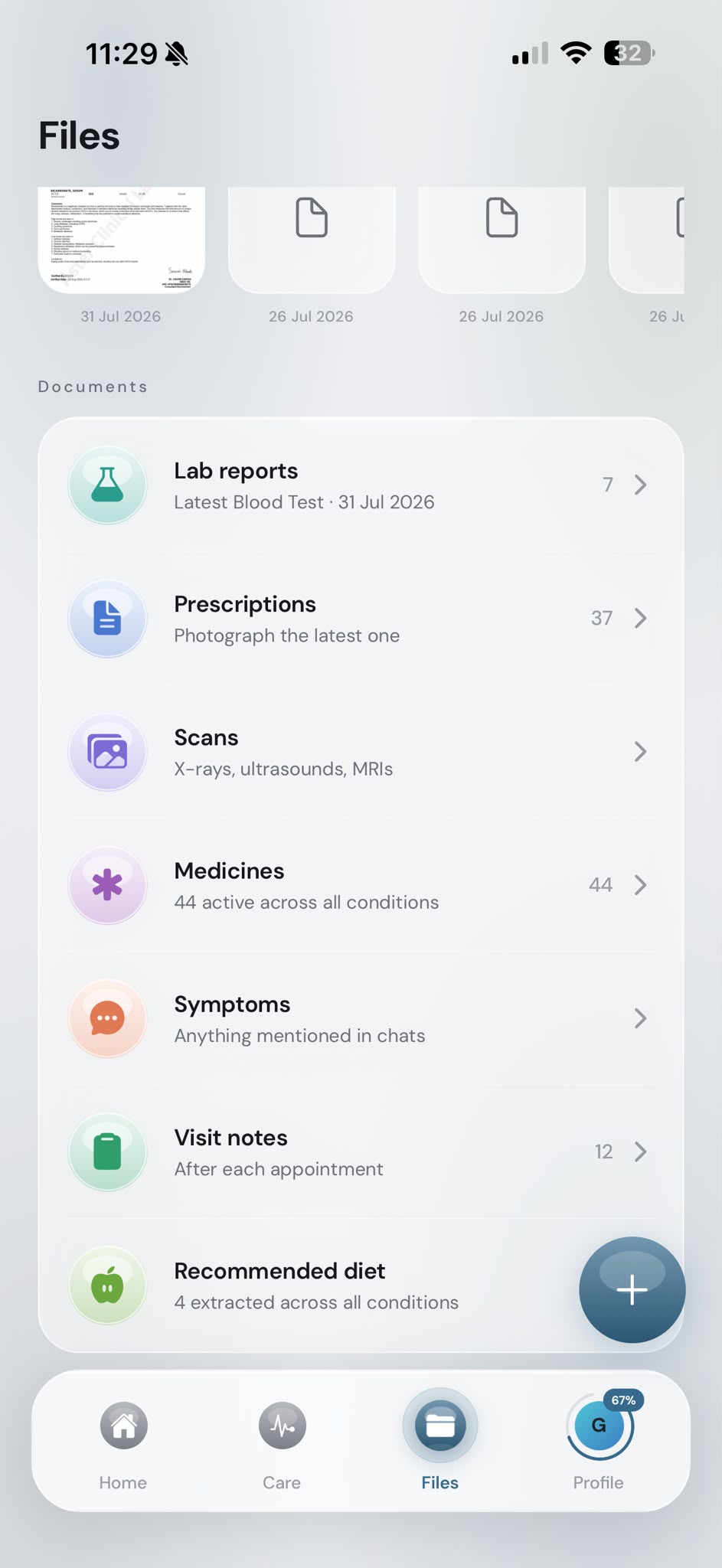
Files screen ▶ walkthrough My UI contribution- Recognisable document previews
- Dates on every file
- File indicators and counts
- Organised grid and list browsing
Design decisions- Previews before names
Recent documents appear as thumbnails with dates, so people can recognise a report by how it looks and when it arrived, not only by its title.
- Categories people already use
Records group into familiar categories such as lab reports, prescriptions, scans and visit notes, each with a count, so the archive reads like folders rather than one long feed.
- 02 / 04 · Feature
Deep Analysis
ProblemDense terminology and unfamiliar measurements.
condition detail ▶ walkthrough 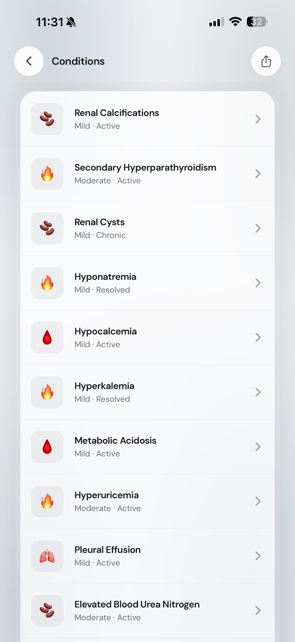
conditions list 
overview My UI contribution- Hierarchical condition information
- Explanatory labels
- Previous readings for comparison
- Visual context through ranges
- Expandable details
Design decisions- Plain language first
Each condition opens with a short explanation in everyday words before the clinical detail, with View more for the full text.
- Values with context
Key markers show the latest reading, the previous one and where it sits on a range, so a number like 5.5 mg/dl arrives with meaning.
- 03 / 04 · Feature
Care Circle
ProblemFamily members coordinating information about different people.
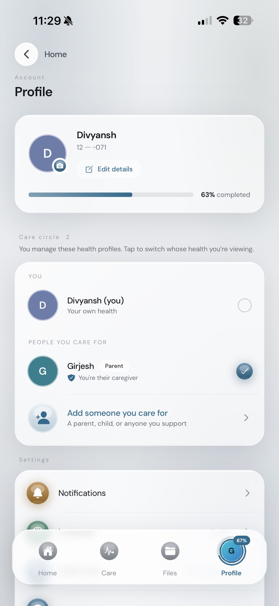
care circle 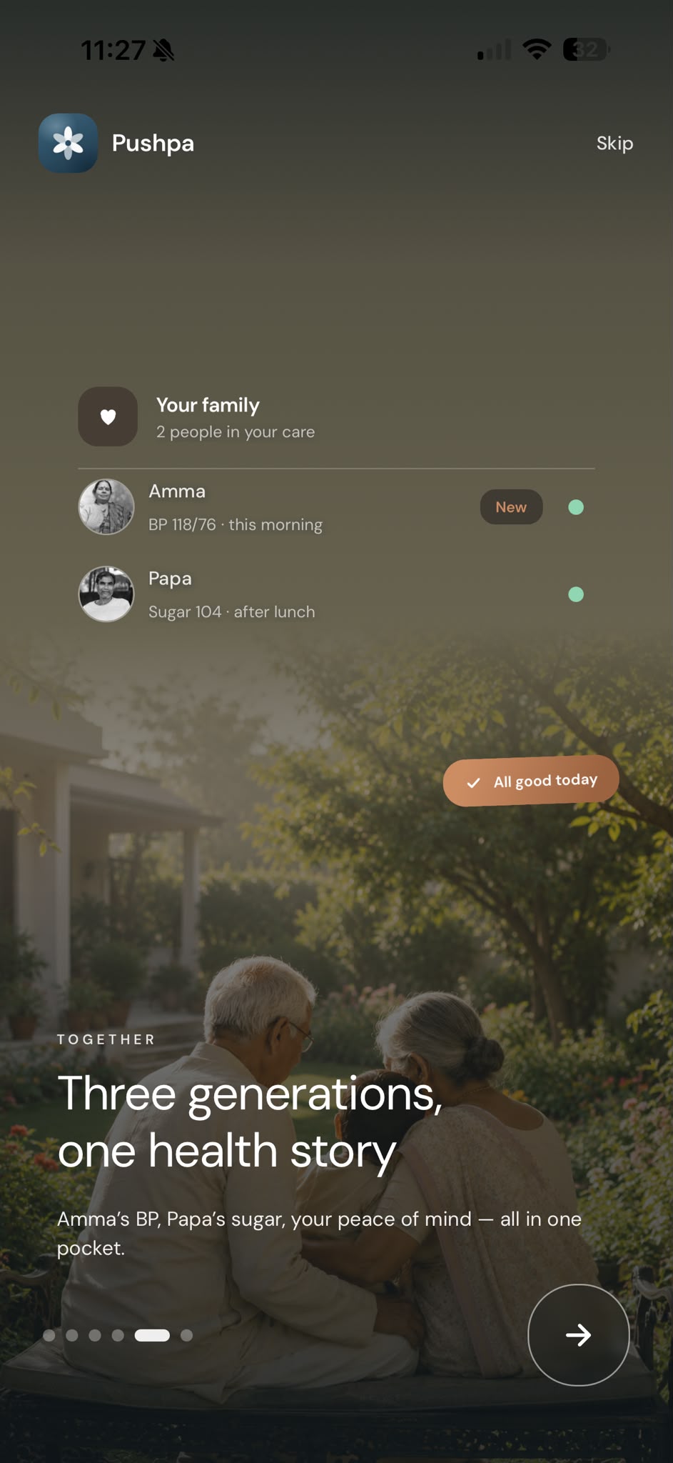
onboarding My UI contribution- Visible profile identities
- Caregiver labels
- Clearer navigation and selection states
Design decisions- Whose health am I viewing?
Your own profile and the people you care for sit in separate groups, with a clear selection mark showing whose health is on screen.
- Relationship labels
Each person carries a relationship tag and a caregiver line, so roles stay explicit when several relatives share the work.
- 04 / 04 · Feature
Everyday Care
ProblemMaking recurring care tasks and changing measurements easier to navigate.
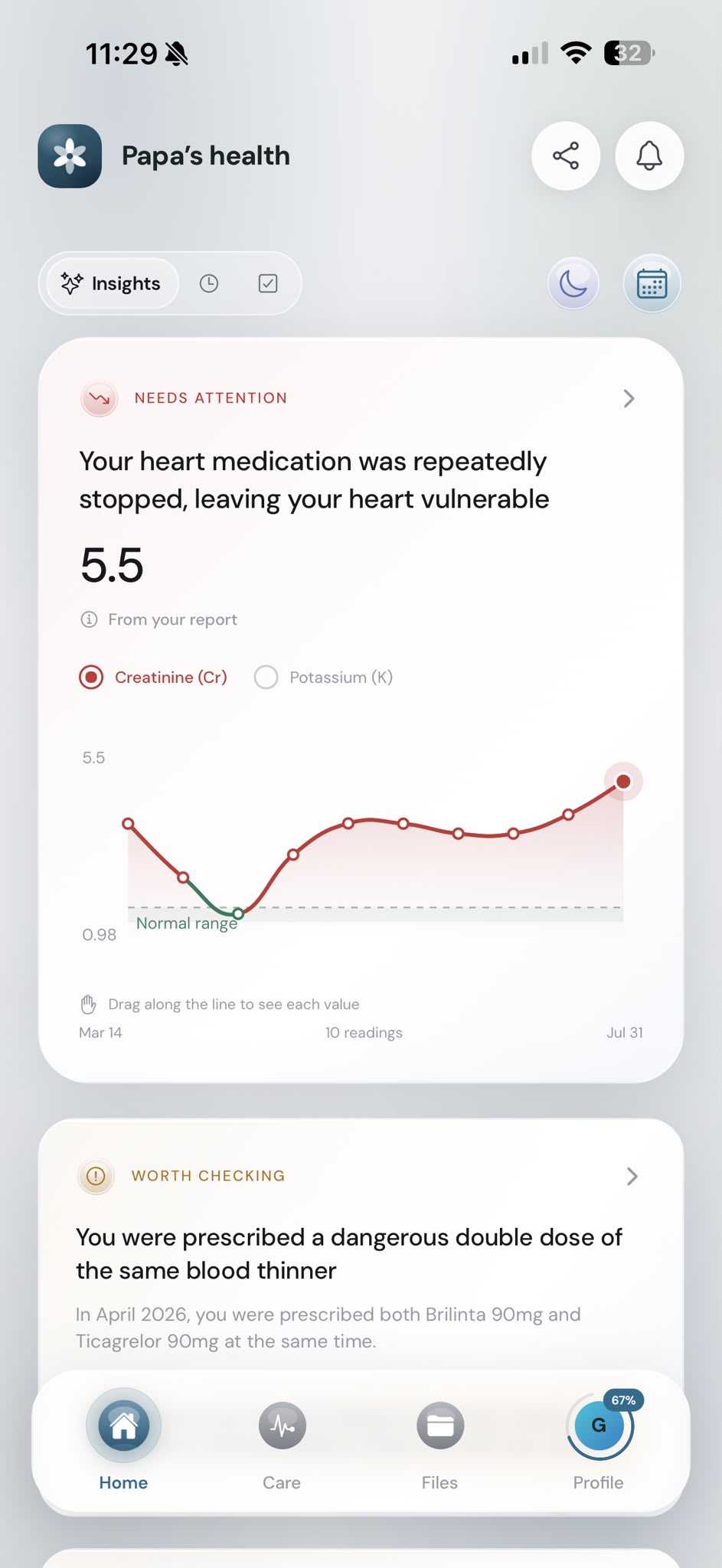
health trend Design reference · not confirmed as implemented UI▶ Design reference · medicine reminder 
onboarding My UI contribution- Scannable status information
- Familiar card patterns
- Readable trend comparisons
Design decisions- Status before detail
Cards lead with a status label such as Needs attention or Worth checking, then a plain-language finding, so priorities scan quickly.
- Trends you can read
Readings plot over time against a shaded normal range, so change is visible without reading every value.
I designed the mobile UI; research and development were collaborative.
Meeting families where they already are.
Not every family member, especially older relatives, will open a health app. The wider Pushpa product supports WhatsApp summaries and phone check-ins as familiar ways in, so each person can take part through a channel they already use.
WhatsApp and phone
Check-in calls and short WhatsApp summaries for family members who don't use the app.
The mobile app UI
The screens where records, health summaries and the care circle come together.

Early results, reported by the team.
A team-reported signal from early validation that the idea resonated.
A product-level figure that reflects the whole product, not the interface alone.
Both figures were reported by the Pushpa team and describe the product as a whole: the concept resonated in early validation, and families brought more of their medical reports into Pushpa. My contribution was the mobile UI for uploading, organising and reading those records.
Reflection
“Pushpa made me think more carefully about the difference between reducing information and making information easier to understand. A cleaner screen isn't necessarily a better one, especially when important medical details need context. The challenge is deciding what someone needs first, what deserves explanation, and what can remain available for deeper exploration.”


