All workDr. Aayu

Dr. Aayu

Making room for better clinical decisions.

Designing a connected clinical workspace that helps healthcare teams manage patients, consultations, schedules, and operational information.

CompanyDayzero.ai
RoleProduct Designer · Clinical Dashboard UI (Collaborative)
FocusEnterprise UX, Dashboard UI, Clinical Workflows, Information Architecture
ContextPatanjali-branded clinical interface
# Dr. Aayu — Dashboard UI · Flat: composed screens
01 Operations overview
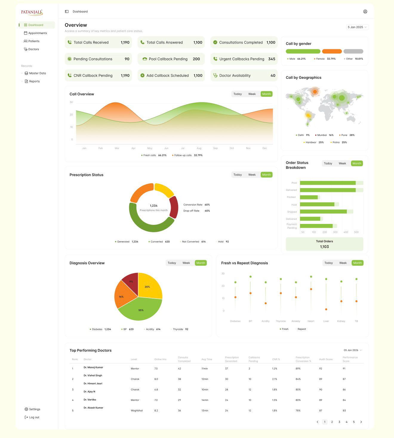
  • Summary metrics for calls, consultations and callbacks
  • Call overview chart across the year
  • Top performing doctors table
02 Appointments
  • Search and the New Appointment action
  • Booking status shown as pills in each row
03 Consultation workspace
  • Reason for visit kept above the clinical sections
  • Rx, Diagnosis, Treatment, Medicine, Diet and Yoga tabs
0×
Diagnostic Speed
Company-reported product claim; methodology not publicly established.
0
Workflow Areas
Design scope: appointment management, registration and booking, consultation, operational reporting and doctor scheduling.
0
Clinical Support Areas
Product capability count based on the public website.
DashboardWorkflowsForms
[01]Overview & impact

A consultation is more than the conversation in the room.

Teams register patients, book appointments, document care, manage doctors' schedules and monitor operations. Dr. Aayu, an AI-assisted healthcare product by Dayzero.ai, brings these together. This case study shows it through a Patanjali-branded clinical interface.

The design challenge: one patient visit passes through several screens and often several people. The interface had to keep the patient's context and the next step clear at every handoff, without stripping out the clinical detail professionals rely on.

My role · UI Designer

I worked alongside other designers at Dayzero.ai across five interface areas, focusing on UI design, information hierarchy, visual consistency, and making information-heavy tasks easier to navigate.

  • Appointment management
  • Registration & booking
  • Consultation
  • Operational analytics
  • Doctor scheduling
[02]The challenge

One visit, six handoffs.

Each stage is a different task, often for a different person, and the patient's context has to survive every handoff.

# Clinical workflow · one visitRetrospective workflow documentation
  1. Stage 1: Patient discovery

    Patients · Appointments

    Search by MR number, name, phone or email.

  2. Stage 2: Registration

    Register new patient

    Basic details, health snapshot and location.

  3. Stage 3: Appointment booking

    Patient profile · Book

    Type, date, doctor and purpose of booking.

  4. Stage 4: Confirmation

    Appointment scheduled

    Booking ID, type, date and doctor repeated.

  5. Stage 5: Consultation

    Telemedicine consultation

    Reason for visit, then structured clinical sections.

  6. Stage 6: Operational follow-up

    Overview · Doctor schedule

    Activity rolls up into metrics and schedules.

Context carried forward

Patient identity Name, MR number and contact details, from first search to the consultation header. Stages 01 · 02 · 03 · 04 · 05

Purpose → reason for visit The summary written at booking becomes the doctor's Reason for Visit. Stages 03 · 05

Booking details Type, date and assigned doctor, through confirmation to the doctor's schedule. Stages 03 · 04 · 06

Activity roll-up Consultations, callbacks and prescriptions surface as operational metrics. Stages 05 · 06

Mapped retrospectively from the captured interface screens. It documents the workflow the product supports; it isn't original user research.

Many hands on one visit

Registration, booking, consultation and follow-up may be handled by different people.

Context has to travel

Who the patient is, and why they're booking, must stay visible from search to consultation.

Detail can't be removed

Complaints, history, allergies and treatment need organising, not hiding.

Operations run alongside care

Calls, callbacks, prescriptions and doctor availability live in the same product.

Design question

How might we help healthcare teams navigate connected clinical and administrative workflows without losing context or adding unnecessary complexity?

[03]Designing the experience

Clearer relationships, not less information.

Five moments in one visit, shown in the real Patanjali screens, followed by everything that can branch from a single booking.

  1. 01 PrincipleSummary before detailThe patient sits above the task it relates to.
  2. 02 PrincipleContext kept in viewThe same patient header from booking to consultation.
  3. 03 PrincipleOne visual languageOne action style, one status pattern, one table pattern.
  4. 04 PrincipleNavigable densityClinical detail in labelled tabs and collapsible sections.
3.1 Patient discovery

Find the right patient from whatever you have.

The problem
Staff may start with only an MR number, a phone number or a name, and need to see where each booking stands.
What we organised
We kept discovery to a single search field that accepts any identifier, showed status in every row, and gave the primary action one consistent position.
Why it matters
The table answers who, when, with whom and in what state before anyone opens a record.
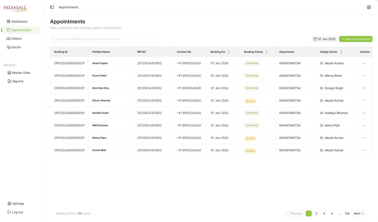
# Appointments · real UI
Appointments table with booking ID, MR number, booking status, department and assigned doctor
  1. 1. One search for MR number, name, phone, email or ID proof
  2. 2. Booking status as a pill in every row
  3. 3. New Appointment in a fixed place, top right
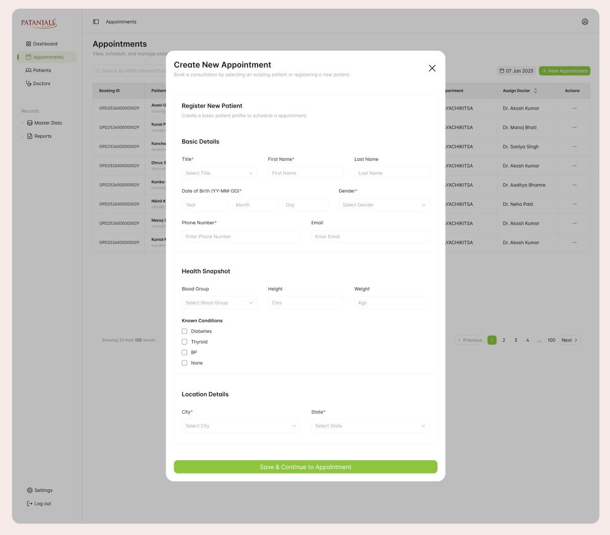
3.2 Registration

A long form, grouped into short ones.

The problem
Registering a new patient means capturing identity, contact, health and location details in one sitting.
What we organised
We grouped the fields into three labelled sections and ended the form with a single action that carries on to the appointment.
Why it matters
Grouping makes a long form easy to scan, and registration leads into booking instead of ending in a dead end.
# Register new patient · real UI
Register new patient form with basic details, health snapshot and location details
  1. 1. Basic details, with required fields marked
  2. 2. Health snapshot: blood group, height, weight, known conditions
  3. 3. Location details
  4. 4. One action that continues straight to booking
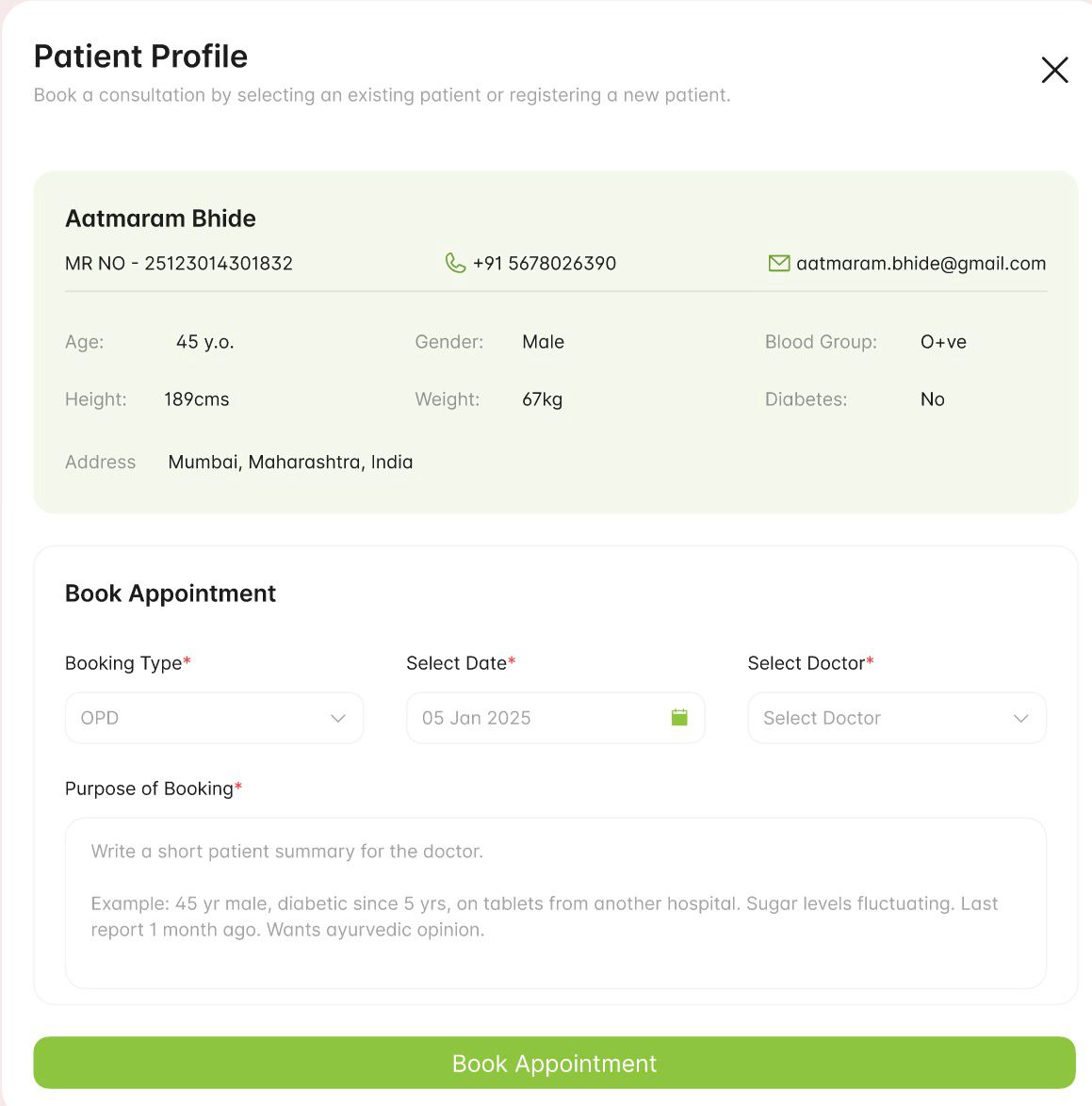
# Patient profile + booking · real UI
Patient profile summary above the Book Appointment form
3.3 Appointment booking

The patient stays above the task.

The problem
When booking, staff need to be sure they have the right person, and the doctor needs a reason for the visit.
What we organised
The patient's summary sits directly above the booking form, and a required Purpose of Booking field asks for a short note for the doctor.
Why it matters
It lowers the risk of booking the wrong patient, and the note written here is the first thing the doctor reads later.
  1. 1. Patient summary: identity, contact and health snapshot
  2. 2. Booking type, date and doctor
  3. 3. Required Purpose of Booking, written for the doctor
  4. 4. A single primary action
3.4 Booking confirmation

Confirm what was booked, not just that it worked.

The problem
A generic success message leaves staff unsure exactly what was scheduled.
What we organised
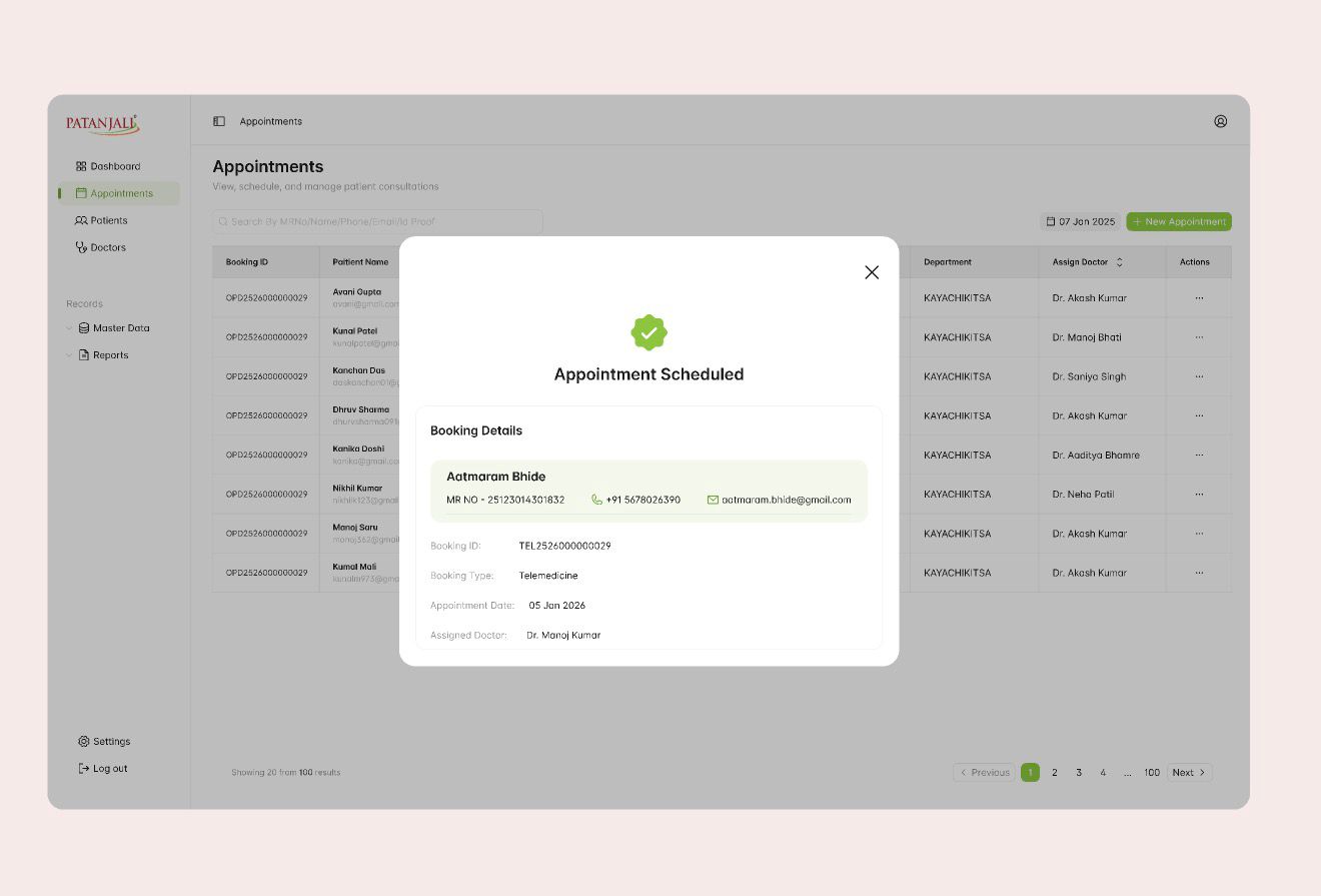
The confirmation repeats the patient's identity alongside the booking ID, type, date and assigned doctor.
Why it matters
Staff can check the details and pass them on to the patient without reopening the record.
# Appointment scheduled · real UI
Appointment Scheduled confirmation with booking ID, type, date and assigned doctor
  1. 1. A clear success state
  2. 2. The same patient identity strip
  3. 3. Booking ID, type, date and assigned doctor
3.5 Consultation

Clinical detail, organised rather than removed.

The problem
Doctors work through complaints, previous treatments, history and allergies, and none of it can be left out.
What we organised
The workspace opens with the patient header and the reason for visit, then splits documentation into labelled tabs and collapsible sections.
Why it matters
Doctors start from context and move through dense information in a predictable order.
# Telemedicine consultation · real UI
Telemedicine consultation workspace with reason for visit, complaint, previous treatments, past history and allergies
  1. 1. Patient header carried from booking
  2. 2. Reason for visit, from the booking note
  3. 3. Rx, Diagnosis, Treatment, Medicine, Diet and Yoga tabs
  4. 4. Add Referral and Save beside the title
  5. 5. Collapsible sections for treatments, history and allergies
3.6 After the booking

One booking. Many next steps.

An appointment doesn't end at scheduling. It becomes the starting point for patient records, consultation updates, referrals, prescriptions and administrative tasks, all reached from the same row.

# One appointment · real UI
One appointment row: booking date, Confirmed status, department, assigned doctor and the row actions button

The row's actions menu: seven next steps, one record.

  1. → Patient record

    Back to the booking, or on to the person

    • View / Edit
    • Patient Profile
    • MRD

    Reopen the appointment, or move to the patient's identity, contact details, health snapshot and medical records.

  2. → Booking state

    Where the booking stands

    • Change Status

    Update the booking; the result shows as the status pill in every row, such as Confirmed or Booked.

  3. → Clinical follow-up

    What happens to the care

    • Add Referral
    • Prescription

    Start a referral or a prescription. Both also appear in the consultation workspace, and prescriptions are tracked on the overview.

  4. → Administration

    Settling the visit

    • Billing

    Start billing from the same record that holds the care.

Why contextual actions In an information-heavy table, the next step lives on the record it affects, so staff continue the work without searching for the patient again. * Destination not in the captured screens; shown as labelled in the product.

[04]Inside the system

Summary first, then the detail behind it.

The same patterns carry into the screens that run the service: operations, doctor scheduling and the shared interface kit.

4.1 Operational visibility

The day's questions at the top, the analysis below.

The problem
Operations teams need a quick read on calls, callbacks and prescriptions before they look at trends.
What we organised
Headline counts lead the page, callback queues sit together, and charts and the doctor table follow beneath.
Why it matters
The most frequent questions are answered first, and the detail is there when someone needs it.
# Operations overview · real UIFigures are mockup data
Operations overview dashboard with call, consultation and callback metrics, charts, prescription status and top performing doctors
  1. A. Calls and consultations, as headline counts
  2. B. Pending, pool, urgent and CNR callbacks together
  3. C. Call trends across the year
  4. D. Prescriptions generated, converted and on hold
  5. E. Calls by gender and geography
  6. F. Doctors ranked on consults, conversion and audit scores
# Doctor profile + schedule · real UI
Doctor profile with a weekly telehealth consultation schedule
4.2 Doctor scheduling

Availability you can read, not work out.

The problem
Coordinators need to know who a doctor is and what their day looks like before booking them.
What we organised
The doctor profile pairs identity and qualifications with a week view, consultations as cards and a marker for the current time.
Why it matters
Gaps and conflicts are visible at a glance, in the same layout as the patient screens.
  1. 1. The same sidebar as every other area
  2. 2. Doctor identity, department and status
  3. 3. Week view with consultations as cards
  4. 4. Current-time marker
4.3 A consistent UI

One set of patterns across every area.

The same six patterns run through every screen above, so each new area is already familiar.

Seen in 3.1 · Appointments

Navigation

One fixed sidebar for every area.

Seen in 3.1 · Appointments

Primary actions

One green action style, top right.

Seen in 3.1 · Appointments

Status

Pills for booking states.

Seen in 3.4 · Confirmation

Patient identity

The same header strip on every screen.

Seen in 4.1 · Overview

Data tables

Ranked rows under clear column headers.

Seen in 3.2 · Registration

Forms

Labelled, grouped, with required markers.

4.4 Clinical AI context

Supporting judgement, not replacing it.

  • Context firstHistory, vitals, labs and the complaint in one view before any analysis.
  • Visible processProcessing states instead of a single instant answer.
  • Physician oversightThe product states that prescriptions are verified by qualified professionals.

Recording of the public dayzero.ai/dr-aayu website, included for the AI capabilities the Patanjali screens don't show. Not an interface I designed.

# Dr. Aayu AI capabilitiesPublic website
[05]Results & evidence

What can be said, and what still needs measuring.

2×
Diagnostic speed

Company-reported product claim; methodology not publicly established. It describes the product as a whole, not the result of my UI work.

5
Workflow areas

Design scope: appointment management, registration and booking, consultation, operational reporting and doctor scheduling.

6
Clinical support areas

Product capability count based on the public website.

Limitations

No usability results are claimed.

I don't have access to usability studies, adoption figures or clinician feedback for this work, so none are reported here. The workflow map and annotations are retrospective documentation of the designed screens.

How it could be evaluated · not completed testing
  1. 01Appointment-booking task success
  2. 02Time to retrieve patient information
  3. 03Registration completion and error rates
  4. 04Consultation documentation usability
  5. 05Dashboard navigation and task efficiency
[06]Reflection & what's next

What this project taught me.

“Dr. Aayu showed me that simplicity for expert users is about clarity, not removing essential information. Doctors and front-desk staff depend on detail, so the work is making the right piece easy to find at the right moment. Because a visit moves between screens and people, it also needs consistent context, so each handoff feels like one continuous task. Above all, enterprise design depends on understanding how people, information and actions relate. Once I could see how a booking connected to a profile, a consultation, a prescription and a bill, the layout decisions became much clearer.”

I worked on Dr. Aayu alongside other designers at Dayzero.ai, across five interface areas. The screens shown are the team's work; my contribution focused on UI design, hierarchy and consistency.

[12]Say hello

Made it this far? Say helloText · 104.

Whether it's a design opportunity, a conversation about research, or just comparing notes on interesting ideas, I'd love to connect.

Local time ● online

--:--:--
Brooklyn, New York.

Version history v26.10

v26.10Portfolio rebuilt as a design file in Framer
© 2026 Tanvi Gera.Brooklyn, New YorkBack to top ↑